Website Redesign - What Were We Thinking?
Every once in a while, it’s nice to dress up in "our finest". We felt it was time to do just that. Our goals for this website redesign were:
- Deliver timely information in one location
- Make it accessible and fast
- Establish a recognizable brand
What We Learned from Our Members
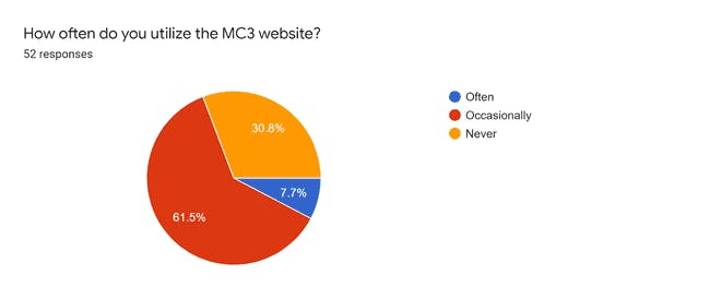
We appreciate your honest feedback! As educators often do, we reflected on our data. We saw that over 90% of the members who responded to our survey either occasionally or never use our website. This left us wondering...
The Questions We Were Left With
- What could we have done to make our website a better place for our members to visit?
- Were we happy with the look, feel, and functionality of what we currently had?
- Are we striving to meet accessibility best practices?
We are confident that our new site is a step in the right direction. There are no silver bullets, and we recognize that we can always improve. If you ever stumble across an issue with this website, please do not hesitate to contact us.
Goal #1: Timely Information in One Place
The MC3 Events Calendar
Once a month, the MC3 membership gathers for a meeting. We wanted members to be able to easily find event and meeting information that was up-to-date. Our "Calendar" page links (behind the scenes) to our MC3 Google Calendar.
Event details are available at a glance along with a link to directions (if the event is in person). This makes it easy for us and for our members to get important event information. Win + Win!
The Blog
Our hope is that this blog (which you are reading right now) will be more than just a place for updates about our website. Our membership is made of outstanding leaders whose students are doing amazing things.
We invite you to volunteer to share the exceptional things your students and staff are doing. We made the process for writing a blog post as frictionless as possible. Just follow the steps below:
- Visit the Contact Us page
- Let us know if you prefer to write a blog post OR present it to the group
- Submit the contact form with an explanation of your proposal.
- Await a Google Doc to be shared with you so that you (and your team if needed) can author your post.
- When your post is completed, let us know and we will review and publish it.
We can’t wait to share your story with our members!
Ignite Presentations
One of the most anticipated components of our monthly meetings, the Ignite presentation can be very impactful. As with our previous site, the new site will continue to showcase the Ignite presentations and presenters. In our pursuit to improve, we will be providing 2 additional features:
- Audio files of the presentation
- Text transcript of the presentation
It may not always be possible to attend our meetings. We don’t want this fact to diminish the impact that our member’s Ignite presenters have. We hope that these new “features” will help and prove beneficial to those with various accessibility needs as well.
Goal #2: Accessible and Fast
Accessibility
We already mentioned one way we are attempting to improve accessibility for our site visitors. We are committed to learning more about how we can do more to help in this area. You may note that all of the images that have appeared in this post have text that appears when you put your cursor over them. This is the “alt” attribute for our image elements.
Alt text is a description of the image’s content that visual users never see (or hear). For those with visual impairments, the screen reader software they use will read this alt text aloud. Our blog posts are written in Google Docs. After you add an image to a Google Doc, you can right-click the image (or use the keyboard shortcut Ctrl+Alt+Y on Windows) and add Alt text.
In addition to helping with the accessibility of our blog posts, if your district uses Google Workspace for Education and you have students with disabilities, this small tip can benefit them as well.
Speed
Admittedly, this section may be a little “geeky” for some of our members. The bottom line is we selected a technology “stack” that provides all of our members and visitors with as fast an experience as we can. See our scores:
The “stack” we mentioned above is called the JAM stack. The JAM acronym stands for “Javascript, APIs, and Markup/Markdown.” While there are many options we could have selected, we went with GatsbyJS which uses the React framework behind the scenes. The code for our site can be found on GitHub if you’d like to explore or contribute.
Part of what makes our site performance score so high is that it is a “static site.” Most sites that we visit are not static. This means that we wait for the computers in the cloud to process and render a page before sending it to us. Our static site eliminates the need for you to wait as we do all that rendering work ahead of time.
The word static might make you think that the information on our site is old or outdated. This is where the “A” in the JAM stack comes into play. For areas where up-to-date information is crucial (like our Calendar page), this information is fetched live each time you visit this page. You can rest assured that the events you see are as up-to-date as they can be.
If you are interested in learning more about this topic, please use our Contact page (link is at the footer of every page) and select “Website” as the reason.
Goal #3: A Recognizable Brand
As district and building leaders, we know and appreciate the power of a strong brand. Developing one is not an exact science nor an easy task. We hope this new site and its design will help.
To help support the development of our brand, we intend to have our social media posts and email communications link back to our site. This is our new home. We hope you are as excited about it as we are.
We Need You…
With any construction project, there is usually some dust and debris that needs to be addressed. If there is a page or resource missing that you are looking for, or you spot a way in which we can do better, please let us know!
Thank you in advance for your support and for making it to the end of our first blog post!


